
library(tidyverse)
library(readxl)
library(sf)
library(tigris)
library(patchwork)

# Add some font settings to theme_void()
theme_fancy_map <- function() {
  theme_void(base_family = "IBM Plex Sans") +
    theme(
      plot.title = element_text(face = "bold", hjust = 0.13, size = rel(1.4)),
      plot.subtitle = element_text(hjust = 0.13, size = rel(1.1)),
      plot.caption = element_text(hjust = 0.13, size = rel(0.8), color = "grey50"),
    )
}On Bluesky the other day, I came across this neat post that suggested using a histogram as a plot legend to provide additional context for the data being shown:
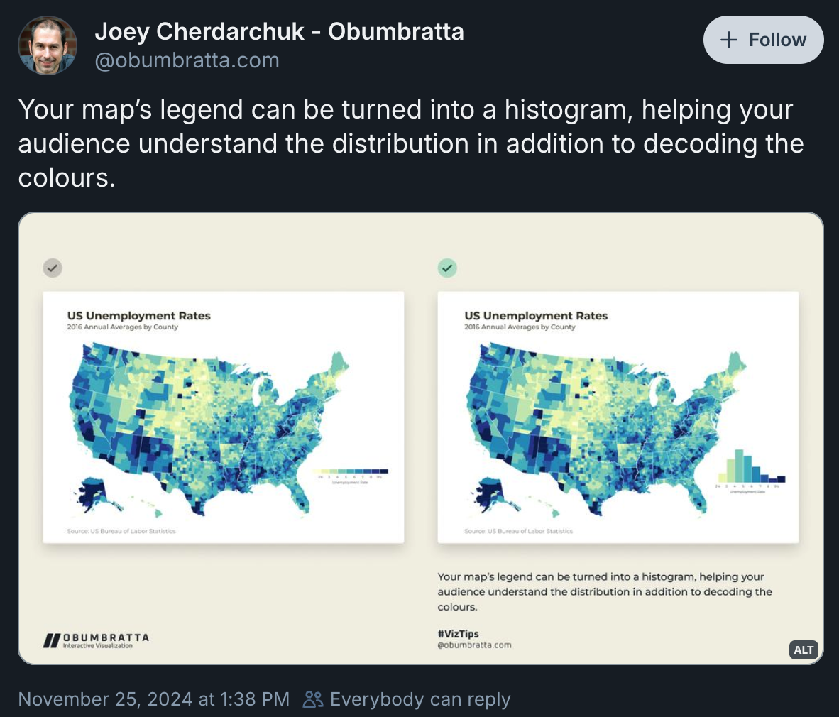
Here’s a closer comparison of those two maps (click to zoom):
This histogram legend is especially useful for choropleth maps where units like counties are sized differently, which can create an illusion of a different distribution. For instance, in that original post, larger dark blue areas stand out a lot visually—like in Alaska, New Mexico, Arizona, and Central California—and make it seem like unemployment is fairly high.
But looking at the histogram that’s not actually the case. Most counties have an unemployment rate around 3–6%. This illusion is happening because land isn’t unemployed—people are.
I thought this was a cool approach, so I figured I’d try to replicate it with R. In the original post, the map was created with D3, the bar chart legend was created with Excel, and the two were combined with Figma. That process is a little too manual for me, but with the magic of R, {ggplot2}, and {patchwork}, we can create the same map completely programmatically.
Let’s do it!
Clean and join data
First, let’s load some packages and tweak some theme settings:
BLS unemployment data
Next, we can get 2016 unemployment data from the Bureau of Labor Statistics. BLS offers county-level data on annual average labor force participation here, both as plain text and Excel files. The plain text data is structured a little goofily (it’s not comma-separated; it’s a fixed width format where column headings span multiple lines), but the Excel version is in nice columns and is easier to work with. Though even then, we need to skip the first few rows, and the last few rows, and specify column names ourselves.
Download this first from the BLS:
For the sake of mapping, we’ll truncate the unemployment rate at 9% and mark any counties with higher than 9% unemployment with 9.1 and modify the legend to show “>9%”:
# Load BLS data and clean it up
bls_2016 <- read_excel(
  "laucnty16.xlsx",
  skip = 5,
  col_names = c(
    "laus_code", "STATEFP", "COUNTYFP", "county_name_state",
    "year", "nothing", "labor_force", "employed", "unemployed", "unemp"
  )
) |>
  # The last few rows in the Excel file aren't actually data, but extra notes,
  # so drop those rows here since they don't have a state FIPS code
  drop_na(STATEFP) |>
  mutate(
    # Truncate the unemployment rate at 9
    unemp_truncated = ifelse(unemp > 9, 9.1, unemp),
    # Find difference from Fed target of 4%
    unemp_diff = unemp_truncated - 4
  )

bls_2016
## # A tibble: 3,219 × 12
##    laus_code       STATEFP COUNTYFP county_name_state   year  nothing labor_force employed unemployed unemp unemp_truncated unemp_diff
##    <chr>           <chr>   <chr>    <chr>               <chr> <lgl>         <dbl>    <dbl>      <dbl> <dbl>           <dbl>      <dbl>
##  1 CN0100100000000 01      001      Autauga County, AL  2016  NA            25710    24395       1315   5.1             5.1        1.1
##  2 CN0100300000000 01      003      Baldwin County, AL  2016  NA            89778    84972       4806   5.4             5.4        1.4
##  3 CN0100500000000 01      005      Barbour County, AL  2016  NA             8334     7638        696   8.4             8.4        4.4
##  4 CN0100700000000 01      007      Bibb County, AL     2016  NA             8539     7986        553   6.5             6.5        2.5
##  5 CN0100900000000 01      009      Blount County, AL   2016  NA            24380    23061       1319   5.4             5.4        1.4
##  6 CN0101100000000 01      011      Bullock County, AL  2016  NA             4785     4457        328   6.9             6.9        2.9
##  7 CN0101300000000 01      013      Butler County, AL   2016  NA             9116     8484        632   6.9             6.9        2.9
##  8 CN0101500000000 01      015      Calhoun County, AL  2016  NA            45450    42470       2980   6.6             6.6        2.6
##  9 CN0101700000000 01      017      Chambers County, AL 2016  NA            14858    14044        814   5.5             5.5        1.5
## 10 CN0101900000000 01      019      Cherokee County, AL 2016  NA            11241    10671        570   5.1             5.1        1.1
## # ℹ 3,209 more rows
Census geographic data
Next we’ll get geographic data from the US Census with {tigris}
Backup data source
At the time of this writing, {tigris} is working. It wasn’t working a couple weeks ago as the wildly illegal Department of Government Efficiency rampaged through different federal agencies—including the US Census—and shut down the Census’s GIS APIs. But it seems to be working for now?
If it’s not working, IPUMS’s NHGIS project offers the same shapefiles.
The BLS data and the Census data each have columns with state and county FIPS codes which we can use to join the two datasets:
# Get county and state shapefiles from Tigris
us_counties <- counties(year = 2016, cb = TRUE) |>
  filter(as.numeric(STATEFP) <= 56) |>
  shift_geometry()  # Move AK and HI

us_states <- states(year = 2016, cb = TRUE) |>
  filter(as.numeric(STATEFP) <= 56) |>
  shift_geometry()  # Move AK and HI

# Join BLS data to the map
counties_with_unemp <- us_counties |>
  left_join(bls_2016, by = join_by(STATEFP, COUNTYFP))

# Check out the joined data
counties_with_unemp |>
  select(STATEFP, COUNTYFP, county_name_state, unemp_truncated, geometry)
## Simple feature collection with 3142 features and 4 fields
## Geometry type: GEOMETRY
## Dimension:     XY
## Bounding box:  xmin: -3112000 ymin: -1698000 xmax: 2258000 ymax: 1566000
## Projected CRS: USA_Contiguous_Albers_Equal_Area_Conic
## First 10 features:
##    STATEFP COUNTYFP    county_name_state unemp_truncated                       geometry
## 1       19      107    Keokuk County, IA             4.3 MULTIPOLYGON (((297173 4548...
## 2       19      189 Winnebago County, IA             3.4 MULTIPOLYGON (((163347 6734...
## 3       20      093    Kearny County, KS             3.1 MULTIPOLYGON (((-482328 605...
## 4       20      123  Mitchell County, KS             3.3 MULTIPOLYGON (((-212918 197...
## 5       20      187   Stanton County, KS             2.8 MULTIPOLYGON (((-528445 214...
## 6       21      005  Anderson County, KY             4.0 MULTIPOLYGON (((940067 1094...
## 7       21      029   Bullitt County, KY             4.1 MULTIPOLYGON (((873753 1022...
## 8       21      049     Clark County, KY             4.7 MULTIPOLYGON (((1012432 106...
## 9       21      059   Daviess County, KY             4.4 MULTIPOLYGON (((749702 5517...
## 10      21      063   Elliott County, KY             9.1 MULTIPOLYGON (((1102886 138...
The map works!
Map adjustments
We need to make a couple little adjustments to the map first. In the original image on Bluesky, there’s extra space on the right side of the map to allow for the legend. We can change the plot window by adding 10% of the width of the map to the right.
Technically we don’t have to work with percents here; the data is currently using the Albers projection, which works in meters, so we could add something like 500,000 meters / 500 km to the left. But this is a more general solution and also works if the map data is in decimal degrees instead of meters.
Also, the far western Aleutian islands mess with the visual balance of the map (and they don’t appear because they’re so small), so we’ll also subtract 10% of the map from the left.
# Get x-axis limits of the bounding box for the state data
xlim_current <- st_bbox(us_states)$xlim

# Add 540ish km (or 10% of the US) to the bounds (thus shifting the window over)
xlim_expanded <- c(
  xlim_current[1] + (0.1 * diff(xlim_current)),
  xlim_current[2] + (0.1 * diff(xlim_current))
)

ggplot() +
  geom_sf(data = us_states, fill = "#0074D9", color = "white", linewidth = 0.25) +
  coord_sf(crs = st_crs("ESRI:102003"), xlim = xlim_expanded)
Extract interior state borders
Because we’re using color = "white", linewidth = 0.25, every state gets a thin white border. This causes some issues though. All the states that share borders actually get a thicker border, since a state’s western border joins up with its neighbor’s eastern border. Also, all the coastlines and islands get borders, which diminishes the landmass—especially on a white background.
Like, look at Alaska’s Aleutian Islands, or Hawai’i’s smaller islands, or Michigan’s Les Cheneaux Islands and Isle Royale, or California’s Channel Islands, or the Florida Keys, or North Carolina’s Outer Banks—they all basically disappear.
To fix this, we can use st_intersection() to identify the intersections of all the state shapes (see this and this for more details)
Now all the islands and coastlines have much better definition and the borders between states are truly sized at 0.25:
interior_state_borders <- st_intersection(us_states) |>
  filter(n.overlaps > 1) |>
  # Remove weird points that st_intersection() adds
  filter(!(st_geometry_type(geometry) %in% c("POINT", "MULTIPOINT")))

ggplot() +
  geom_sf(data = us_states, fill = "#0074D9", linewidth = 0) +
  geom_sf(data = interior_state_borders, linewidth = 0.25, color = "white") +
  coord_sf(crs = st_crs("ESRI:102003"), xlim = xlim_expanded)
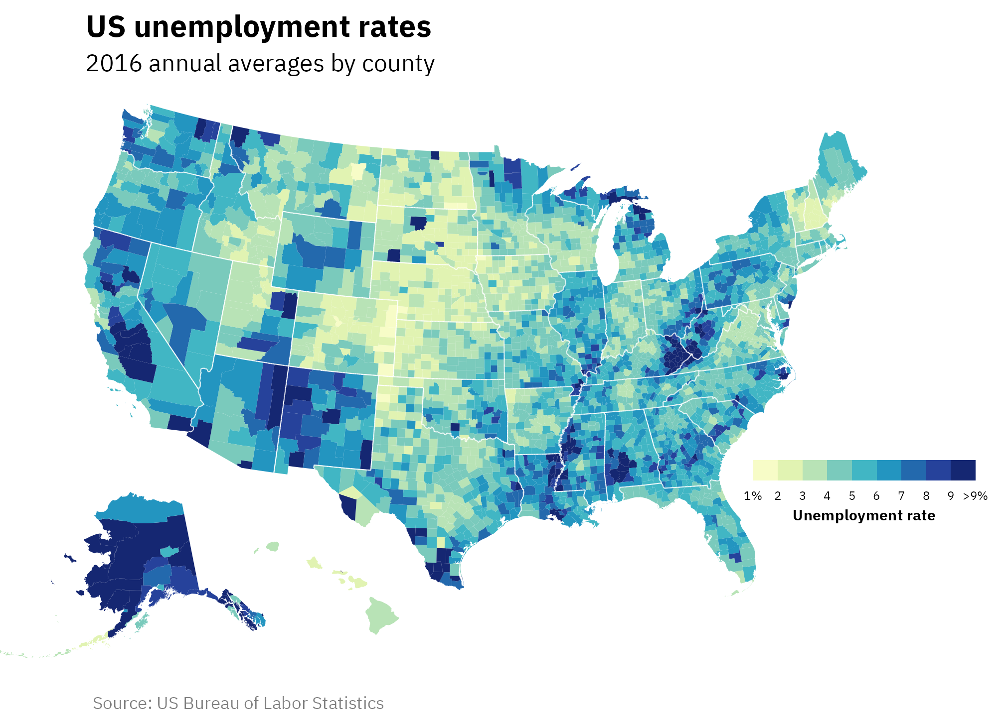
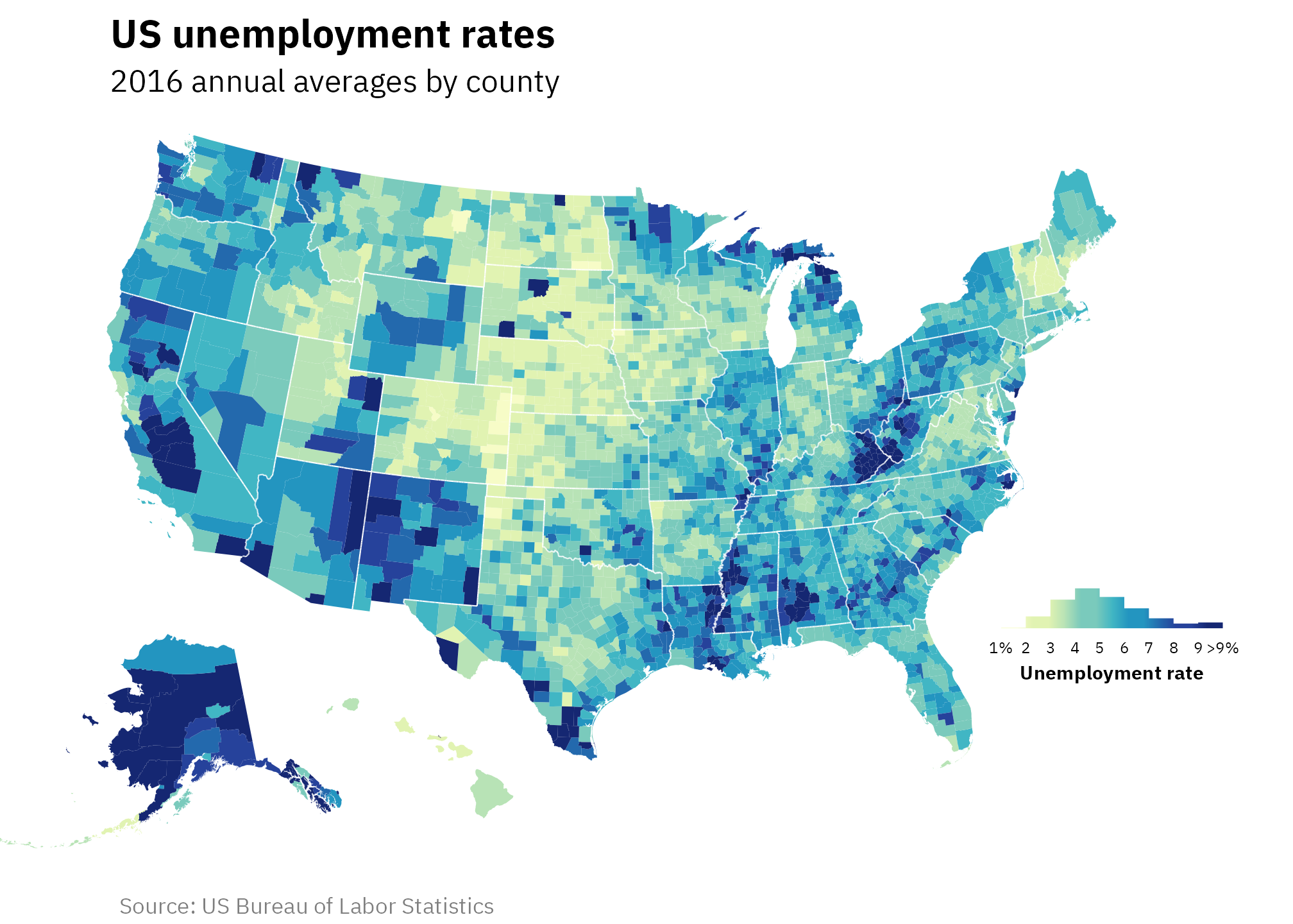
Map with horizontal gradient step legend
Now that we have cleaned and adjusted geographic and unemployment data, we can make a fancy map! Instead of building this sequentially, I’ve included all the code all at once, with lots of comments at each step.
A few things to note:
scale_fill_stepsn()lets you use distinct bins of color instead of a continuous gradient-
We position the legend inside the plot with
theme(legend.position = "inside", legend.position.inside = c(0.86, 0.32)). Those0.86, 0.32coordinates took a lot of tinkering to get! The units forlegend.position.insideare based on percentages of the plot, so the legend appears where x is 86% across and 32% up. The position changes every time the plot dimensions change. To make life easier as I played with different values, I used {ggview} to specify and lock in exact dimensions of the plot:I’m not using
ggview::canvas()here in the post because I’m specifying figure dimensions with Quarto chunk options instead (fig-width: 7andfig-height: 5).
Here’s the map!
ggplot() +
  # Add counties filled with unemployment levels
  geom_sf(
    data = counties_with_unemp, aes(fill = unemp_truncated), linewidth = 0
  ) +
  # Add interior state boundaries
  geom_sf(
    data = interior_state_borders, color = "white", linewidth = 0.25
  ) +
  # Show the unemployment legend as steps instead of a standard gradient
  scale_fill_stepsn(
    colours = scales::brewer_pal(palette = "YlGnBu")(9),
    breaks = 1:10,
    limits = c(1, 10),
    # Change the label for >9%
    labels = case_match(
      1:10,
      1 ~ "1%",
      10 ~ ">9%",
      .default = as.character(1:10)
    )
  ) +
  # Yay labels
  labs(
    title = "US unemployment rates",
    subtitle = "2016 annual averages by county",
    caption = "Source: US Bureau of Labor Statistics",
    fill = "Unemployment rate"
  ) +
  # Use Albers projection and new x-axis limits
  coord_sf(crs = st_crs("ESRI:102003"), xlim = xlim_expanded) +
  # Theme adjustments
  theme_fancy_map() +
  theme(
    legend.position = "inside",
    legend.position.inside = c(0.86, 0.32),
    legend.direction = "horizontal",
    legend.text = element_text(size = rel(0.55)),
    legend.title = element_text(hjust = 0.5, face = "bold", size = rel(0.7), margin = margin(t = 3)),
    legend.title.position = "bottom",
    legend.key.width = unit(1.55, "lines"),
    legend.key.height = unit(0.7, "lines")
  )
Map with histogram legend
We can replace the step gradient legend with a histogram that is filled using the same colors as the step legend.
The easiest method that gives us the most control over the legend histogram is to create a separate plot object for the histogram and place it inside the map with {patchwork}’s inset_element().
Here’s the histogram, again with comments at each step. Only one neat trick to note here:
-
geom_histogramautomatically determines the bin width for the variable assigned to the x aesthetic. In order to fill each bar by bin-specific color, we need to access information about those newly created bins. We can do this withafter_stat()—here we fill each bar using the already-calculated x bin categories withfill = after_stat(factor(x))
hist_legend <- ggplot(bls_2016, aes(x = unemp_truncated)) +
  # Fill each histogram bar using the x axis category that ggplot creates
  geom_histogram(
    aes(fill = after_stat(factor(x))),
    binwidth = 1, boundary = 0, color = "white"
  ) +
  # Fill with the same palette as the map
  scale_fill_brewer(palette = "YlGnBu", guide = "none") +
  # Modify the x-axis labels to use >9%
  scale_x_continuous(
    breaks = 2:10,
    labels = case_match(
      2:10,
      2 ~ "2%",
      10 ~ ">9%",
      .default = as.character(2:10)
    )
  ) +
  # Just one label to replicate the legend title
  labs(x = "Unemployment rate") +
  # Theme adjustments
  theme_fancy_map() +
  theme(
    axis.text.x = element_text(size = rel(0.55)),
    axis.title.x = element_text(size = rel(0.68), margin = margin(t = 3, b = 3), face = "bold")
  )
hist_legend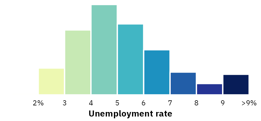
Next, we’ll place that hist_legend plot inside a map with inset_element(). Like legend.position.inside = c(0.86, 0.32) in the previous map, the left = 0.75, bottom = 0.26, right = 0.98, top = 0.5 values here are percentages of the plot area and they’re fully dependent on the overall dimensions of the plot. Getting these exact numbers took a lot of manual adjusting, and ggview::canvas() was once again indispensable for keeping the plot dimensions constant.
unemp_map <- ggplot() +
  # Add counties filled with unemployment levels
  geom_sf(
    data = counties_with_unemp, aes(fill = unemp_truncated), color = NA, linewidth = 0
  ) +
  # Add interior state boundaries
  geom_sf(
    data = interior_state_borders, color = "white", linewidth = 0.25, fill = NA
  ) +
  # Show the unemployment legend as steps instead of a standard gradient, but
  # don't actually show the legend
  scale_fill_stepsn(
    colours = scales::brewer_pal(palette = "YlGnBu")(9),
    breaks = 1:10,
    guide = "none"
  ) +
  # Yay labels
  labs(
    title = "US unemployment rates",
    subtitle = "2016 annual averages by county",
    caption = "Source: US Bureau of Labor Statistics"
  ) +
  # Use Albers projection and new x-axis limits
  coord_sf(crs = st_crs("ESRI:102003"), xlim = xlim_expanded) +
  # Theme stuff
  theme_fancy_map()

# Add the histogram to the map
combined_map_hist <- unemp_map +
  inset_element(hist_legend, left = 0.75, bottom = 0.26, right = 0.98, top = 0.45)
combined_map_hist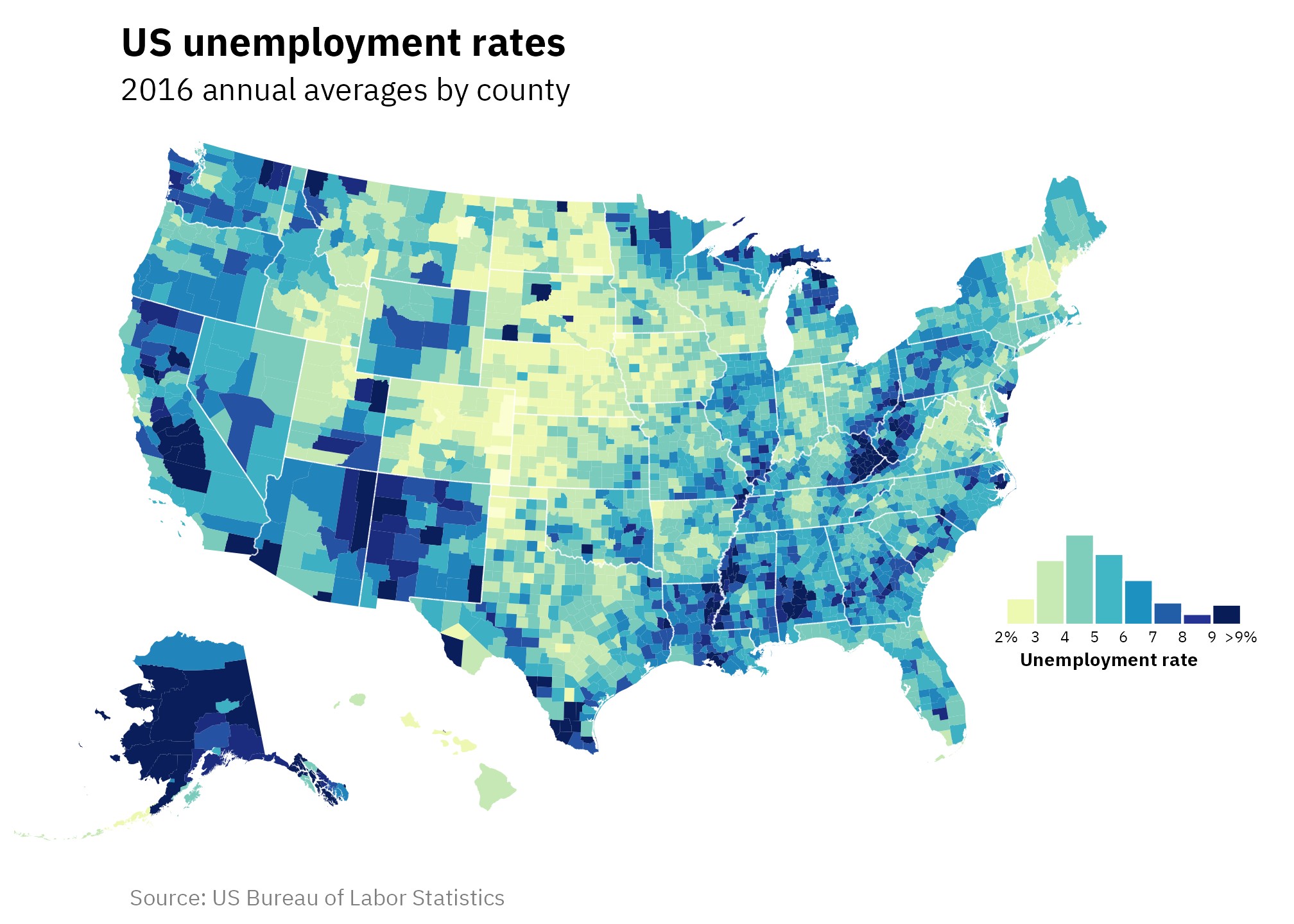
Map with automatic histogram legend with {legendry}
Finally, the new {legendry} package makes it so we can create a custom histogram-based legend without needing to use {patchwork} with a separate histogram plot!
It doesn’t provide as much control over the resulting histogram. The gizmo_histogram() function uses base R’s hist() behind the scenes, so we have to specify bin widths and other settings in hist.arg as base R arguments, like breaks = 10 instead of ggplot’s binwidth = 10.
Not all of hist()’s options seem to work here. For instance, I get a warning if I use border = "white" to add a white border around each bar (argument ‘border’ is not made use of), since that border option is disabled when using base R’s hist() with plot = FALSE:
hist(counties_with_unemp$unemp_truncated, breaks = 10, border = "white", plot = FALSE)
## Warning in hist.default(counties_with_unemp$unemp_truncated, breaks = 10, : argument 'border' is not made use of
## $breaks
##  [1]  1  2  3  4  5  6  7  8  9 10
##
## $counts
## [1]  12 244 589 821 644 410 205  97 119
##
## $density
## [1] 0.00382 0.07768 0.18752 0.26138 0.20503 0.13053 0.06527 0.03088 0.03789
##
## $mids
## [1] 1.5 2.5 3.5 4.5 5.5 6.5 7.5 8.5 9.5
##
## $xname
## [1] "counties_with_unemp$unemp_truncated"
##
## $equidist
## [1] TRUE
##
## attr(,"class")
## [1] "histogram"
Also, it’s currently filling each histogram bar with the full gradient, not the 9 distinct steps, and I can’t figure out how to define custom colors for each bar—and it might not even be possible since color settings aren’t picked up anyway because of {legendry}’s use of plot = FALSE 🤷♂️.
But despite these downsides, this automatic histogram legend with {legendry} is really neat!
library(legendry)

# Create a custom histogram guide
histogram_guide <- compose_sandwich(
  middle = gizmo_histogram(just = 0, hist.arg = list(breaks = 10)),
  text = "axis_base"
)

ggplot() +
  # Add counties filled with unemployment levels
  geom_sf(
    data = counties_with_unemp, aes(fill = unemp_truncated), color = NA, linewidth = 0
  ) +
  # Add interior state boundaries
  geom_sf(
    data = interior_state_borders, color = "white", linewidth = 0.25, fill = NA
  ) +
  # Show the unemployment legend with a custom histogram guide
  scale_fill_stepsn(
    colours = scales::brewer_pal(palette = "YlGnBu")(9),
    breaks = 1:10,
    limits = c(1, 10),
    guide = histogram_guide,
    # Change the label for >9%
    labels = case_match(
      1:10,
      1 ~ "1%",
      10 ~ ">9%",
      .default = as.character(1:10)
    )
  ) +
  # Yay labels
  labs(
    title = "US unemployment rates",
    subtitle = "2016 annual averages by county",
    caption = "Source: US Bureau of Labor Statistics",
    fill = "Unemployment rate"
  ) +
  # Use Albers projection and new x-axis limits
  coord_sf(crs = st_crs("ESRI:102003"), xlim = xlim_expanded) +
  # Theme stuff
  theme_fancy_map() +
  theme(
    legend.position = "inside",
    legend.position.inside = c(0.86, 0.32),
    legend.direction = "horizontal",
    legend.text = element_text(size = rel(0.55)),
    legend.title = element_text(hjust = 0.5, face = "bold", size = rel(0.7), margin = margin(t = 3)),
    legend.title.position = "bottom"
  )
Bonus! Use points instead of choropleths
We’re still using choropleth maps here, which still isn’t ideal for showing the idea that “land isn’t unemployed”. One solution is to plot points that are sized by population. This is pretty straightforward with {sf}—we need to convert the county polygons into single points, which we can do with st_point_on_surface(). Then, after a bunch of tinkering with legend options, we’ll have this gorgeous map:
# Convert the county polygons into single points
counties_with_unemp_points <- counties_with_unemp |>
  st_point_on_surface()

unemp_map_points <- ggplot() +
  # Use a gray background
  geom_sf(data = us_states, fill = "gray90", linewidth = 0) +
  geom_sf(data = interior_state_borders, linewidth = 0.25, color = "white") +
  # Include semi-transparent points with shape 21 (so there's a border)
  geom_sf(
    data = counties_with_unemp_points,
    aes(size = labor_force, fill = unemp_truncated),
    pch = 21, color = "white", stroke = 0.25, alpha = 0.8
  ) +
  # Control the size of the points in the legend
  scale_size_continuous(
    range = c(1, 9), labels = scales::label_comma(),
    breaks = c(10000, 100000, 1000000),
    # Make the points black and not have a border
    guide = guide_legend(override.aes = list(pch = 19, color = "black"))
  ) +
  # Show the unemployment legend as steps instead of a standard gradient, but
  # don't actually show the legend
  scale_fill_stepsn(
    colours = scales::brewer_pal(palette = "YlGnBu")(9),
    breaks = 1:10,
    guide = "none"
  ) +
  # Labels
  labs(
    title = "US unemployment rates",
    subtitle = "2016 annual averages by county",
    caption = "Source: US Bureau of Labor Statistics",
    fill = "Unemployment rate",
    size = "Labor force"
  ) +
  # Albers
  coord_sf(crs = st_crs("ESRI:102003"), xlim = xlim_expanded) +
  # Theme stuff
  theme_fancy_map() +
  theme(
    legend.position = "inside",
    legend.position.inside = c(0.837, 0.13),
    legend.text = element_text(size = rel(0.55)),
    legend.title = element_text(hjust = 0.5, face = "bold", size = rel(0.7), margin = margin(t = 3)),
    legend.title.position = "bottom"
  )

# Add the histogram to the map
combined_map_hist_points <- unemp_map_points +
  inset_element(hist_legend, left = 0.75, bottom = 0.26, right = 0.98, top = 0.45)
combined_map_hist_points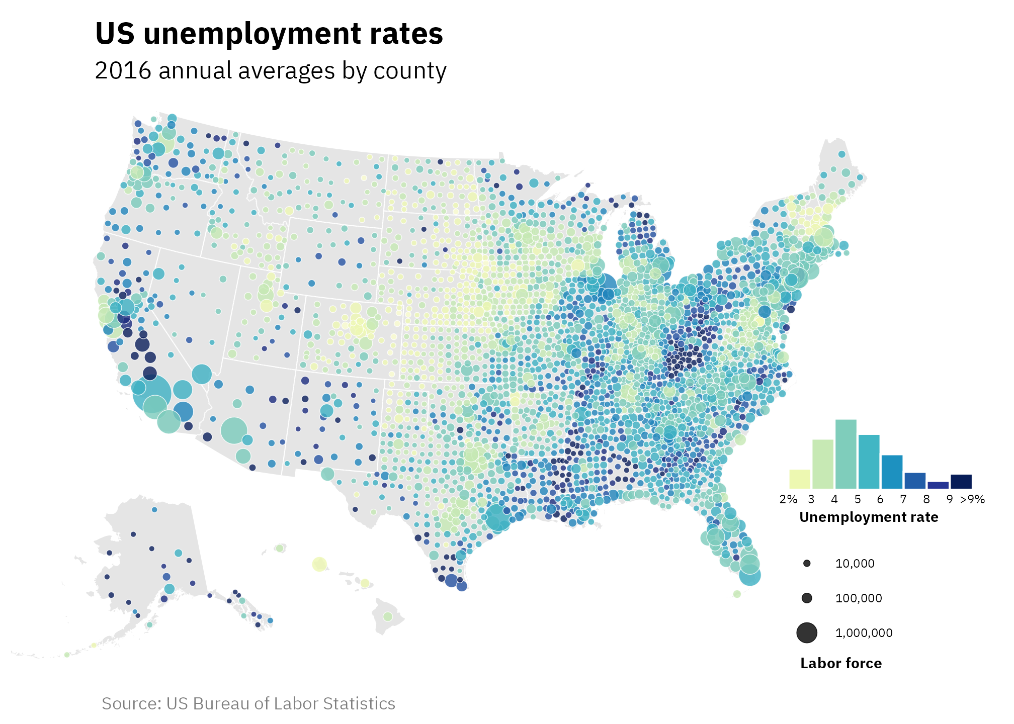
Bonus #2! Use a diverging color scheme + nested legend circles
But wait, there’s more! Based on discussions with really smart dataviz people on Bluesky in the wake of me posting about this blog post there, we can make two additional tweaks:
-
While the different sizes for the points are neat, I’m not a fan of how big the vertical spacing is between the 10,000; 100,000; and 1,000,000. Unfortunately there’s no way to change it. Technically we can use
legend.key.spacing.yintheme()to adjust it, but that doesn’t work as expected here because each of those legend entries is sized to match the largest point—i.e., the point for 1,000,000 is the biggest, so the legend entries for all the other values match its height, even if they don’t need all that space.To fix this, we can use
guide_circles()from {legendry} to show the different point sizes as coencentric circles, which is more compact (and just looks neat). -
Instead of showing a range of low → high values, we can color these counties based on a meaningful midpoint to help highlight which counties are doing great (low unemployment! good!) and which aren’t (high unemployment! bad!). That might not always necessarily be the best approach—showing the full range of actual values like in the original map is a way of just describing the range and doesn’t inherently imply good or bad. But in other plots where data might be more actionable, divergences from some central value would be much more helpful.
In the United States, the Federal Reserve has a unique dual mandate to use macroeconomic policies to target both inflation and unemployment (most other countries’ central banks only target inflation). The Fed typically aims for an inflation rate of 2% and an unemployment rate of 4ish%. So in this new map, we’ll center each county’s unemployment rate around 4% and show the percentage point deviations from that Fed target. Counties colored in darker red have higher unemployment rates than the target; counties colored in blue have lower rates than the target.
We can then imagine that we’re a policymaker interested in unemployment trends—we can look at the map and quickly identify areas that are doing poorly and doing well.
Up at the beginning of the document where we loaded and cleaned the bls_2016 dataset, I’ve added a new variable that centers the unemployment rate at 4:
mutate(unemp_diff = unemp_truncated - 4)We can then use this to create a new histogram and new map colored with the “vik” palette from the {scico} package, which has lots of neat diverging palettes. We’ll also create a fancy circle-based legend with {legendry}. Here’s the fully annotated code and final map:
library(ggtext)  # For Markdown-based text in ggplot
library(scico)   # For perceptually uniform colors

# Make new histogram legend
hist_legend_diffs <- ggplot(bls_2016, aes(x = unemp_diff)) +
  # Fill each histogram bar using the x axis category that ggplot creates
  # Use boundary = 0.5 to shift the bin ranges from things like 1-2 to 1.5-2.5
  geom_histogram(
    aes(fill = after_stat((x))),
    binwidth = 1, boundary = 0.5, color = "white"
  ) +
  # Fill with the same palette as the map
  # scale_fill_brewer(palette = "YlGnBu", guide = "none") +
  scale_fill_scico(palette = "vik", midpoint = 0, guide = "none") +
  # Modify the x-axis labels to show perentage point values and format them with
  # markdown to get original unemployment values on separate lines
  scale_x_continuous(
    breaks = -2:5,
    labels = case_match(
      -2:5,
      -2 ~ "**−2 pp.**<br>(2%)",
      0 ~ "**0**<br>(4% ±<br>0.5 pp.)",
      5 ~ "**>+4 pp.**<br>(>9%)",
      .default = glue::glue(
        "**{x}**",
        x = scales::label_comma(
          style_positive = "plus", style_negative = "minus"
        )(-2:5))
    )
  ) +
  # Just one label to replicate the legend title
  labs(x = "Difference from Fed target") +
  # Theme adjustments
  theme_fancy_map() +
  theme(
    axis.text.x = element_markdown(size = rel(0.5), vjust = 1, lineheight = 1.3),
    axis.title.x = element_text(size = rel(0.68), margin = margin(t = 3, b = 3), face = "bold")
  )

unemp_map_points_diffs <- ggplot() +
  # Use a lighter gray background
  geom_sf(data = us_states, fill = "gray95", linewidth = 0) +
  # Use slightly darker state borders
  geom_sf(data = interior_state_borders, linewidth = 0.25, color = "grey60") +
  # Include semi-transparent points with shape 21 (so there's a border)
  geom_sf(
    data = counties_with_unemp_points,
    aes(size = labor_force, fill = unemp_diff),
    shape = 21, color = "white", stroke = 0.25, alpha = 0.8
  ) +
  # Control the size of the points in the legend
  scale_size_continuous(
    range = c(1, 11), labels = scales::label_comma(),
    breaks = c(100000, 1000000, 5000000),
    # Make the points black and not have a border
    guide = guide_circles(
      text_position = "right",
      override.aes = list(
        fill = "grey30", alpha = 0.8
      )
    )
  ) +
  # This is tricky! We want to use the diverging vik palette but have it
  # centered at 0. With scale_fill_scico(), there's a midpoint argument, like we
  # used for the histogram. For generating regular lists of colors with scico(),
  # though, there's no midpoint argument. Instead, we need to make a few
  # specific adjustments:
  #
  # 1. Generate 11 possible colors, since there are 5 colors above the 0
  #    midpoint in the histogram and we need 5 parallel negative colors below 0
  #    (even though we're only using 2)
  # 2. Set the limits of the legend to the symmetrical -5 to 5 range so that
  #    it's centered at 0
  # 3. Set the breaks to go asymmetrically from -2:5. But actually set them
  #    from -2.5 to 4.5 since that matches the shifted histogram, which uses a
  #    boundary of 0.5 instead of 0 (so the histogram bins cover ranges like
  #    0.5 to 1.5 instead of 0 to 1)
  scale_fill_stepsn(
    colours = scico::scico(11, palette = "vik"),
    limits = c(-5, 5),
    breaks = seq(-2.5, 4.5, by = 1),
    guide = "none"
  ) +
  # Labels
  labs(
    title = "US unemployment (2016)",
    subtitle = "Differences from the Federal Reserve's 4% target",
    caption = "Source: US Bureau of Labor Statistics",
    fill = "Unemployment rate",
    size = "County labor force"
  ) +
  # Albers
  coord_sf(crs = st_crs("ESRI:102003"), xlim = xlim_expanded) +
  # Theme adjustments
  theme_fancy_map() +
  theme(
    # {legendry} complains if there's no legend.margin setting; using
    # theme_void() removes that setting and breaks the plot, so we specify
    # some 0 values here
    legend.margin = margin(0, 0, 0, 0, "pt"),
    legendry.legend.key.margin = margin(0, 5, 0, 0, "pt"),
    legend.ticks = element_line(colour = "black", linetype = "22"),
    legend.position = "inside",
    legend.position.inside = c(0.87, 0.17),
    legend.text = element_text(size = rel(0.55)),
    legend.title = element_text(hjust = 0.5, face = "bold", size = rel(0.7), margin = margin(t = 3)),
    plot.subtitle = element_text(hjust = 0.18),
    legend.title.position = "bottom"
  )

# Add the histogram to the map
combined_map_hist_points_diffs <- unemp_map_points_diffs +
  inset_element(hist_legend_diffs, left = 0.75, bottom = 0.26, right = 0.98, top = 0.45)
combined_map_hist_points_diffs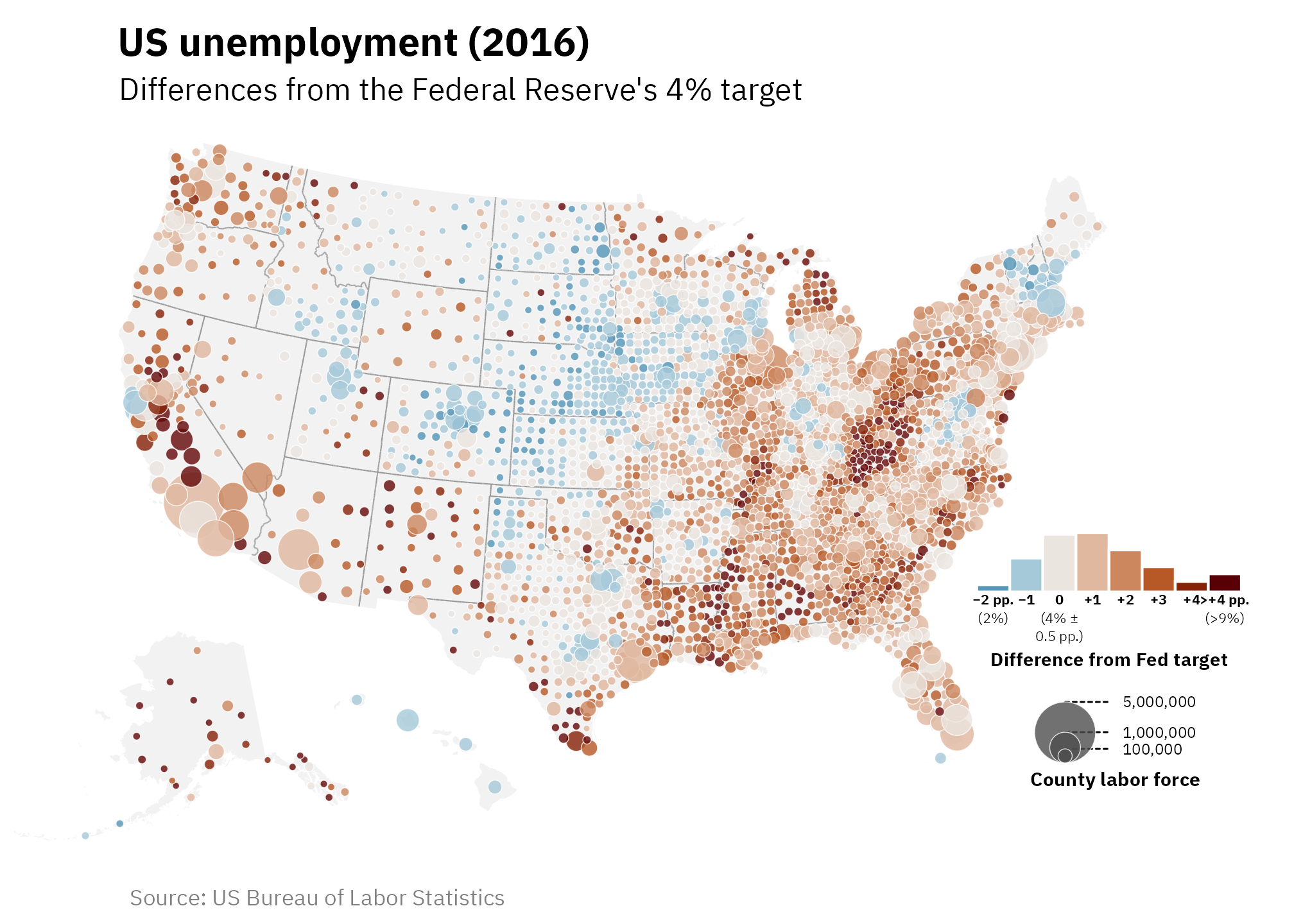
Citation
BibTeX citation:
@online{heiss2025,
  author = {Heiss, Andrew},
  title = {How to Use a Histogram as a Legend in \{Ggplot2\}},
  date = {2025-02-19},
  url = {https://www.andrewheiss.com/blog/2025/02/19/ggplot-histogram-legend/},
  doi = {10.59350/gt0nr-wct91},
  langid = {en}
}
For attribution, please cite this work as:
Heiss, Andrew. 2025. “How to Use a Histogram as a Legend in
{Ggplot2}.” February 19, 2025. https://doi.org/10.59350/gt0nr-wct91.